Blog
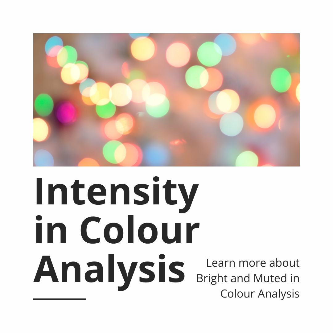
Understanding Intensity in Colour Analysis: How Bright/Soft is your Colouring?
In the world of personal colour analysis, intensity is one of the most misunderstood and overlooked dimensions. Whether a colour is bright or muted (also called soft in some systems) can drastically influence how harmonious it looks on an individual. Yet, this distinction is often lost, especially in the age of AI-driven and online colour analysis tools.
Let’s break down what intensity really means, why it matters, and how to spot red flags in the industry.
What is Intensity?
Intensity refers to how clear or soft a colour appears. Think of it this way:
- Bright (High Intensity): Colours that are vivid, saturated, and free from grey. They may be pure hues or lighter/darker variations, but their defining quality is their clarity. Bright colours appear bold, crisp, and energizing, whether that’s a clear turquoise, vibrant fuchsia, or true cobalt.
- Muted (Low Intensity): Colours that have grey added. They appear more subdued, blended, and soft, like dusty rose, sage green, or taupe.
If you were mixing paints, bright colours would be colours in their pure form, clean and intense, while muted colours would be those same hues with grey mixed in, softening the effect.
Muted Palettes
In the system I use, the muted home seasons are Summer and Autumn. Both have a softness, but they express it differently:
- Summer: Entirely muted – these colours are all tones (colours mixed with grey).
- Autumn: A mix of tones and shades (colours with either gray or black added), giving a grounded, earthy feel.
- Between these two sits the Muted flow palette, a season-neutral space defined specifically by low intensity. All other dimensions – undertone and value – are neutral here.
There are muted (soft) flow palettes, but they only exist from home seasons that naturally contain muted qualities. This means you might flow into Soft Autumn or Soft Summer, but if you’ve been given a result like Soft Spring, that would be highly questionable.
It’s common for people exploring colour analysis to assume they, or others, must be soft. However, in practice, this is one of the rarest palettes. Very few individuals genuinely fit into the Muted flow group, and the majority do not ‘flow’ between seasons at all. If you’ve been typed as soft without an in-person analysis, it’s worth questioning the accuracy of that result.
Why “Soft” is being overused in Colour Analysis
Lately, there’s been a noticeable trend in online and AI-based colour analysis tools: everyone’s being typed as “Soft Summer” or “Soft Autumn.” These tools often generate highly edited images of clients with digitally enhanced hair, makeup, and lighting to match that season. While they look appealing, they’re not necessarily accurate.
These enhanced photos can subtly shift the qualities of someone’s natural skin tone, making them appear more muted or warm/cool-toned than they truly are. As a result, people may be misclassified as soft or muted simply because the image has been manipulated to fit that category.
Muted palettes are especially popular in fashion and interiors right now, which makes them an easy default for online or mass-produced colour analysis systems. From a business perspective, it’s simpler to funnel the majority of clients into the same ‘soft’ result – these palettes feel familiar, are widely available in stores, and tend to generate less pushback or follow-up questions. In contrast, being placed in a bright palette can challenge someone’s comfort zone, since those colours are bolder and less common in everyday wardrobes. This is often where clients need more support and education to understand why those colours truly flatter them. Unfortunately, that kind of guidance is rarely built into quick online analyses, which is why so many results skew toward muted categories.
If you’re getting results from a service that seems to funnel everyone into a soft season – this is a red flag.
Bright Palettes
Opposite muted, we find the bright palettes. These colours have high clarity – there are no tones in the palette. In the system I use, the bright home seasons are Winter and Spring:
- Winter: A mix of tints and shades (colours with either white or black added)
- Spring: Entirely tints (colours with white added).
- The Bright flow palette sits between them and is also defined by high intensity, while remaining neutral in undertone and value.
There are bright flow palettes, but they only exist from home seasons that naturally contain high-intensity colours. This means you might flow into Bright Spring or Bright Winter but there are no Bright Autumns or Summers.
People with bright colouring often have a clarity to their features: eyes that catch the light, skin that reflects back colour cleanly, and an overall look that holds up to high-intensity hues.
The Challenges of Bright Palettes
One of the challenges for those in the bright palettes is that these colours are often harder to find in stores, especially when muted tones dominate fashion trends. This can leave bright clients second-guessing their results, wondering if such bold colours are truly “wearable.” Many also worry that bright colours will make them stand out too much. In reality, the opposite is true: when bright individuals wear their best colours, the clothing fades into harmony with their natural colouring, allowing them to shine. When they wear muted tones, the effect is draining, and the clothes tend to overshadow the person instead of enhancing them.
Why Intensity Matters
Understanding your colour intensity can dramatically change how you approach your wardrobe and makeup:
- If you’re muted, wearing bright colours can make you look overwhelmed or washed out.
- If you’re bright, muted tones can dull your features and make you look tired or even sickly.
When I work with clients in person, intensity is one of the key dimensions we assess using physical drapes and high quality lighting – not a filtered photo. It’s an essential part of truly seeing how your natural colouring interacts with different intensity levels.
Trust the Process, not the Filters
While it’s tempting to try a quick app, colour analysis is about so much more than algorithms and photo editing. It’s about observing how colour behaves on your actual skin, in person, without digital interference.
If you’ve been told you’re “soft” but feel unsure about the results – trust that instinct. Not everyone is muted, and most people don’t fall into a flow category. A personalized, in-person session can bring clarity and confidence to your colour journey.
Ready to discover your true intensity?
Book a colour analysis session with me at Prismatic Style and let’s uncover the hues that bring you to life (no filters required).